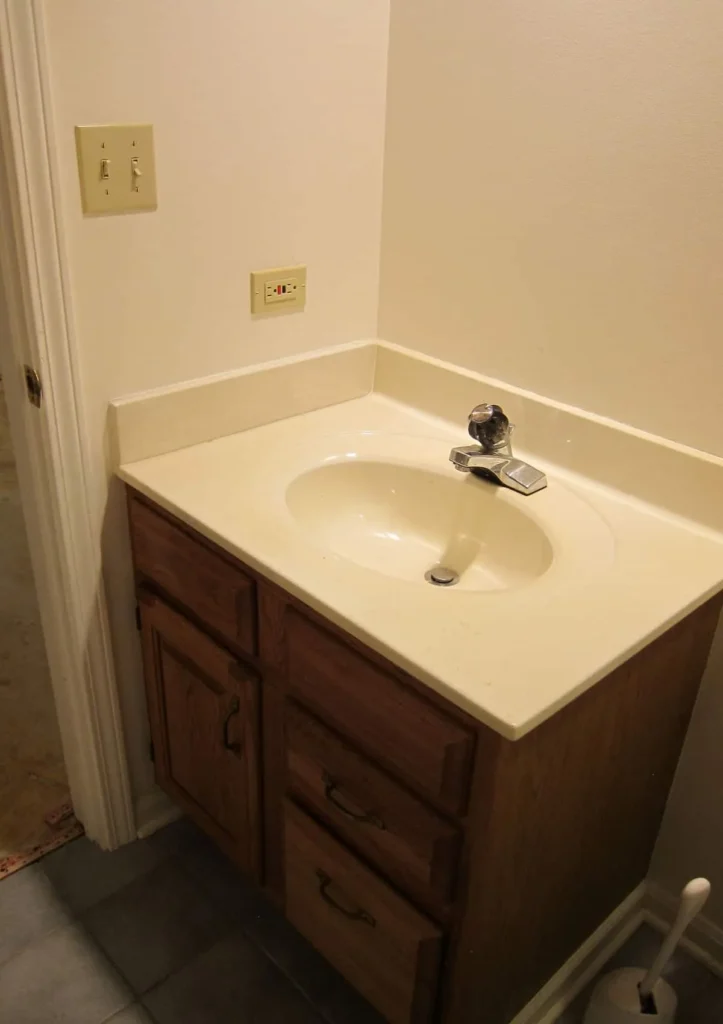
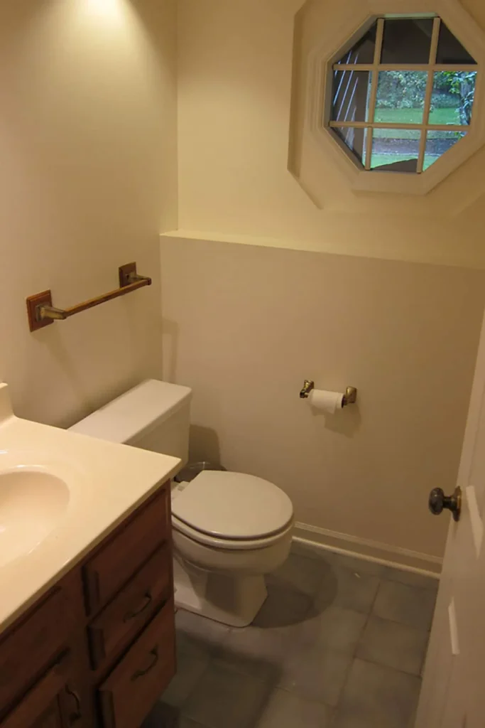
I’ve been writing this blog for over ten years, and I sometimes feel like I’m still learning how to do it. One thing I’ve missed is showing proper before-and-after photos, but that changes today! I’m excited to share a boring, outdated bathroom that I transformed into a simple yet beautiful black-and-white space. This renovation happened a while ago after the basement flooded, which inspired me to refresh the old powder room. With a few updates and some creativity, I turned it into something special. Let’s take a look back at this amazing transformation!
The Boring Bathroom Renovation In The Basement

Renovating the basement wasn’t on our list, especially just six weeks after moving into the house. But then the Boy had a little accident. He filled the laundry room sink and got distracted by coffee and Facebook. When he finally walked back, he saw a wet floor and thought, “Oh no, what happened?” To our surprise, it was raining in the basement! The carpets were soaked, and the drywall was ruined. Since we were already fixing things, I suggested we give the boring bathroom a makeover, too. It felt like a good chance to change things while we were at it. What started as a small problem turned into a big project!

I was working on the black and white bathroom while also doing the Potty Paradise project. I signed up for the One Room Challenge, so I couldn’t change my mind. That meant I was renovating three rooms at once! I wanted the bathroom to look classic with black and white, and Potty Paradise would be fun. It was hard to manage all these projects, but it was exciting too. Each choice I made was important for how the rooms would feel. I wanted them to connect nicely, mixing fancy and playful styles. With every tile and color I chose, I got closer to showing everything off.
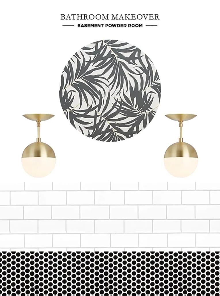
Black And White Bathroom Mood Board

I came across this black and white wallpaper with touches of gold, and I couldn’t get it out of my head. Since there’s no shower in this room, humidity wouldn’t be a problem, so I decided to go for wallpaper. To protect against mess and water damage from the kids, I tiled the bottom half and wallpapered the top.
With two bathroom renovations going on, plus a basement fix and a new house, I had to stay on budget. The palm frond wallpaper was affordable, and the simple white subway tile and black penny tile kept costs down.
Basement Bathroom Renovation Process
Bathroom renovations can be tricky, but luckily, there were no surprises in the black and white bathroom, unlike Potty Paradise. However, we did run into two issues.
First, the person hanging the wallpaper didn’t realize it was removable, which confused him. We did this in 2016 when peel-and-stick wallpaper wasn’t as common, so he made things harder than they needed to be. The wallpaper was water-activated—you just spray and hang—but he used too much paste, and it kept sliding around.
The biggest splurge in the black and white bathroom was the Jason Wu for Brizo faucet, which has a funny story. While Gerry was installing it, I heard some cursing. An hour later, he came into my office and said, “Did you know the faucet you ordered has a battery pack?” I had no idea. The battery pack was hard to install because the pedestal sink was close to the wall. After some frustration, he figured it out and explained that the battery powers a light on the faucet that shows if the water is cold, warm, or hot. Weird, but I guess it’s helpful, especially for the kids.
A year after installing the faucet, I was invited to Delta Faucet’s headquarters in Indiana (Brizo is their luxury line). They were showing off the cool features of the Jason Wu for Brizo faucet, including the motion sensor! I literally stopped the woman mid-presentation and said, “Wait, my faucet can be turned on with touch and is motion-activated? That’s what the batteries are for?” When I got home, I played with it for an hour—it felt like Christmas! I still laugh every time I see it.
White Subway Tile And Black Penny Tile
Looking back at my two bathroom renovations, I can’t help but compare how each design has aged. The black penny tile in the black and white bathroom still holds a special place in my heart. It’s timeless, simple, and has aged beautifully, without a hint of feeling outdated. On the other hand, the bold encaustic cement tile in Potty Paradise, while eye-catching, feels a bit too trendy now. I’m kind of over it. But that black penny tile? It’s a classic. I have zero regrets about staying on the safe side with it—it’ll never go out of style.
After Gerry installed the white subway tiles, he suggested finishing them with a Schluter tile edging trim. I wasn’t sure at first, but I’m so glad I went with it. That small touch of brass blends beautifully with the black and white wallpaper, adding just the right contrast. It’s a simple but stylish detail that really pulls the whole room together. Gerry’s idea was great, and it made the space feel more polished and elegant. I couldn’t be happier with how it turned out. It was the perfect finishing touch.
When I was choosing grout, many people were going for black grout with white subway tiles. Instead, I picked a slightly off-white grout with a hint of gray. I love trends, but I didn’t want something permanent that might go out of style. The result is subtle and classic, just what I wanted. The same goes for the black penny tile; we used dark charcoal grout that adds a little contrast without being too loud. It creates a smooth, sophisticated look that feels timeless. I’m really happy with the choices I made.
Lighting For The Bathroom Renovation
This boring bathroom had a soffit with recessed lighting and an exhaust fan/ceiling light combo that didn’t fit my style. I wanted some pretty brass pendant lighting over the sink, so we opened up the soffit to check for any hidden pipes or space. Luckily, it was empty, so Gerry removed the soffit entirely. This gave me the height I needed to hang a beautiful Palo Alto semi-flush mount light. It was originally designed by Cedar and Moss and later sold through Rejuvenation. The new light has completely transformed the space, adding elegance and charm. I couldn’t be happier with how it turned out!
Unfortunately, we had to replace these lights because the bulbs burnt out and we couldn’t open the globes to change them. This was a known problem, and they suggested using a credit card to break the vacuum seal. We got one globe open, but not the other, and then the light blew out again. It was really frustrating, and customer service from both companies didn’t help us. If you like these globe lights, be careful. Based on my experience, I’d say to skip them. It’s not worth the hassle.
Since this is the basement bathroom and I needed better lighting, I decided to replace the old lights with the Cora Pendant Light by Mitzi. They hang a bit lower, which gives the space a warm and inviting feel. I absolutely love them! After 2-3 years of use, I’ve had zero issues, which is a big relief. Plus, they were $15 less than the original lights from Rejuvenation, making them a great value. The new pendants really brighten up the room and enhance the overall look. I couldn’t be happier with my choice!
Decor For The Black And White Bathroom
To warm up the black and white bathroom, I chose a modern round wood mirror. It helps break up the contrast and adds a natural touch. This mirror comes in two sizes, and I picked the smaller one, which is 24 inches in diameter. The wood grain looks beautiful and adds nice texture to the space. It works well with the sleek tiles and softens the overall look. This mirror has become a favorite feature in the bathroom. I’m really happy with my choice!
Finding a modern toilet paper holder was harder than I thought. After months of searching, I finally found the Ferm Living toilet paper holder, and I really love it. The price has come down to $35, which is great. Now I still need to find a towel holder I like. When I first decorated the black and white bathroom, I thought an antique wood ladder would be nice. I found one at the flea market, and I liked it, but now it feels a bit overdone because of the modern farmhouse trend. I’m thinking about getting a modern towel holder, but for now, the ladder stays.
Where’s The Art?
This space has minimal decor because I’ve never found the perfect art piece. I thought I did once, but I messed it up. Recently, I went to the flea market with Marianne, and we spotted a giant portrait that I thought would look great with the palm frond wallpaper. I forgot that the half wall has subway tile, though, and when I hung it up, it looked really weird. So, my search for wall decor continues, and I’ll keep you updated!

